The Power Of Colors In Marketing And Branding
We have widely known that colors have a powerful psychological impact. That’s why the right (or wrong) colors can influence the way a consumer acts, especially in online marketing. By properly using color theory in building your brand name, it is pretty sure that you will have better sales, increase your conversion rates, and be recognizable within the online industry.
In this article, we break down all the ways in which colors could evoke feelings, control mood, and solidify your message so that you will have better knowledge to make decisions about colors.
The color philosophy
According to the Institute for Colour Research, an average person subconsciously judges an item within the first 90 seconds they see. And the color is a key factor during that process of judgment
Researches also show that colors can increase brand recognition by up to 80%. They exist nowhere but in the mind of people who experience them.
People associates colors with various emotions and meanings. As a result, when building your brand name, you should take into account this information in order to stay consistent throughout the entire marketing strategy and successfully convey the corporate message to its customers.
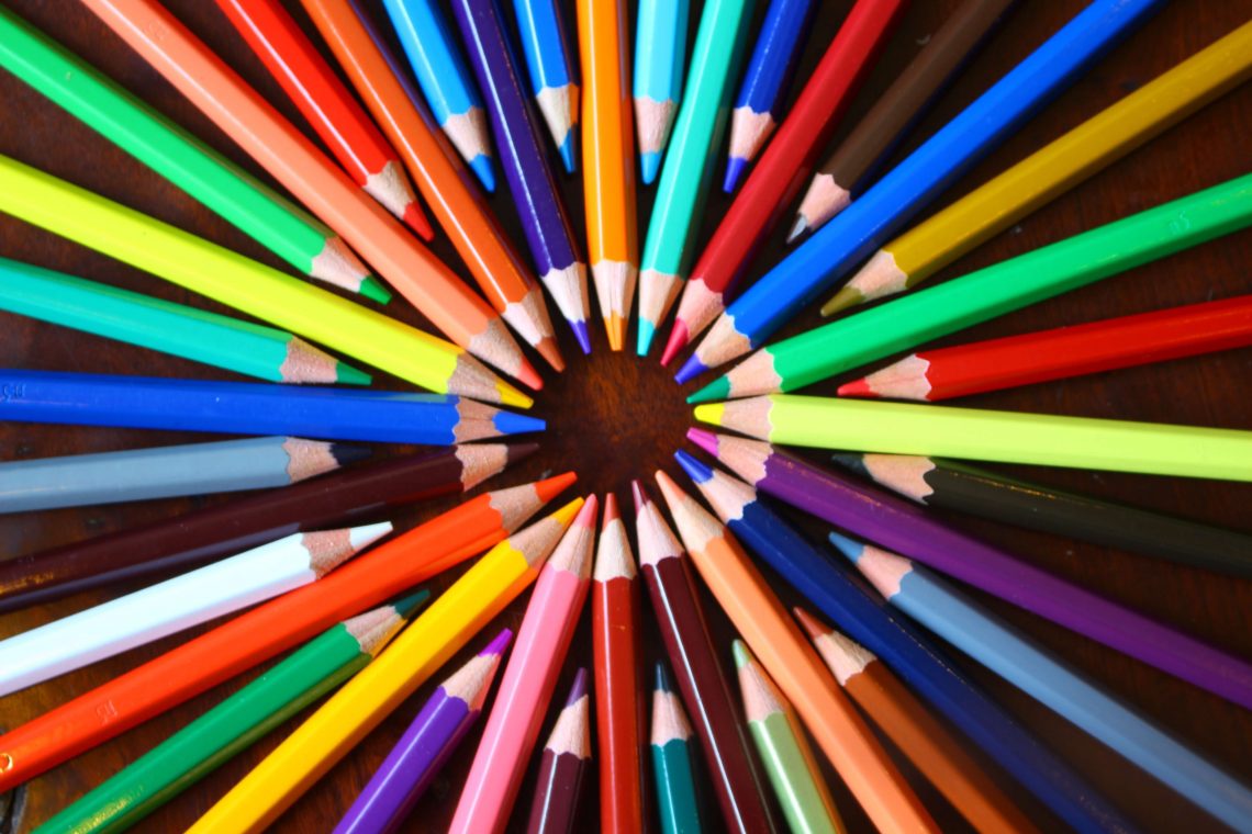
Let’s have a quick run through 11 color guides and their universal perceived meanings.
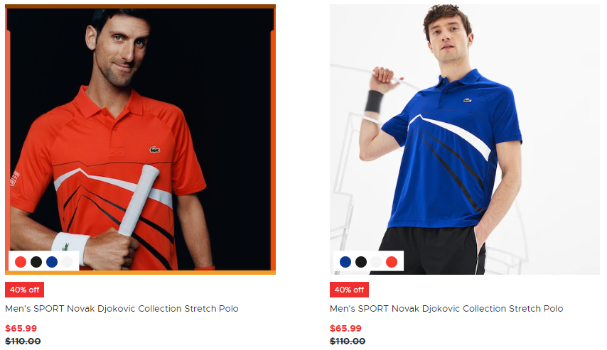
Red
This color is a symbol of power. It gives people more energy and excitement which would make it a great fit for a rebellious, innovative or revolutionary brand name.
Moreover, red also creates a sense of urgency because it captures readers’ attention, which is good for clearance sales or a call-to-action button. With this strong color, make sure you don’t overuse it because flooding your online store with red may result in negative visual impact and people will not want to look at your page for long.
Blue
Blue always associates with peace, security, and tranquility. Therefore, people perceive it as a very positive color and hugely popular for tech companies and banks.
Believe it or not, opposite with red, research shows that blue can curb appetite. That’s why you should not use this pigment if your products have a direct link with food.
Yellow
Yellow most often connects with enthusiasm and optimism. It also has the benefit of attention grabbers, can lift your spirit up and remind us of warmth. A little touch of yellow can help your website visitors think of something positive.
Green
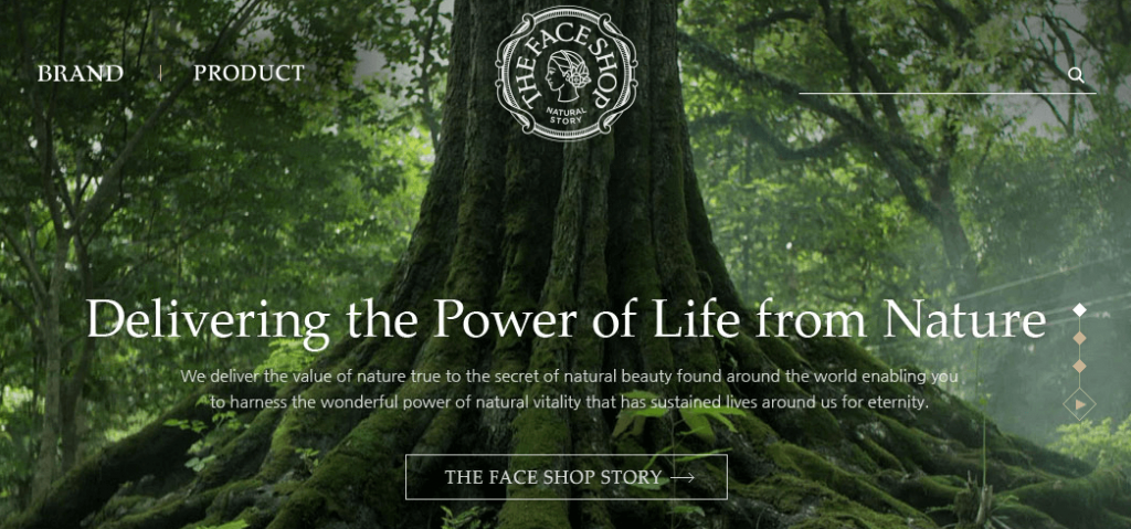
Green symbolizes growth, health, and the environment. It is a relaxing color for customers’ eyes and brains. It can be a perfect theme for your store if you sell products that are environment-friendly, especially with the lighter shades of green.
The Face Shop uses green as the main color for their page, in which they state that their inspiration originates from nature and their products are full of natural beauty.
Orange
Orange can trigger a sense of cheer and confidence. It is usually used to appeal to children because orange adds a bit of fun to pictures, websites or marketing materials it’s on. It can draw an eye on but is not as demanding as red.
Purple
This color commonly represents royalty, wisdom, and respect. Therefore, it is ideal to go with a luxurious aspect or a creative identity. However, you had better watch out as the overuse of purple can make people feel arrogant.
Pink
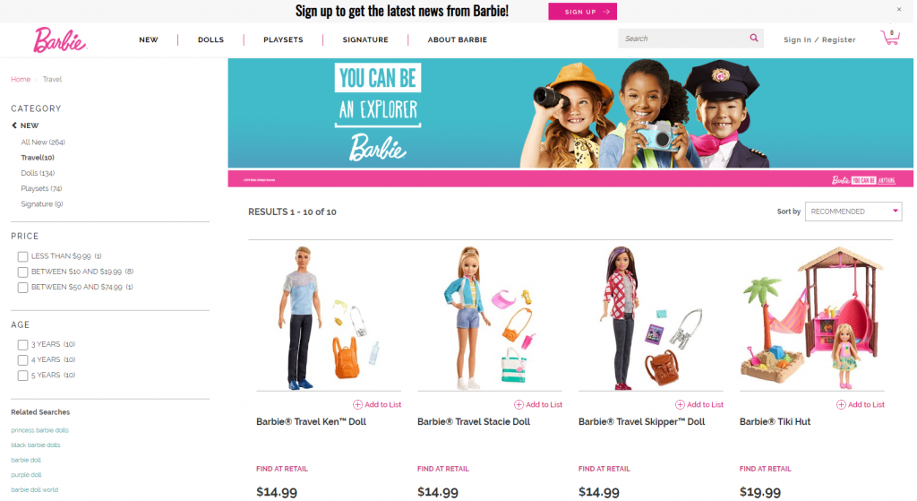
People have long considered pink a girly color showing a romantic feel.
It’s not surprising that Barbie, one of the most famous brands making toys for girls, uses pink as their main color. This palette is featured in its logo, the top navigation and drop-down menu and some CTA buttons as ‘Sign Up’, ‘Add To List’.
Brown
Brown elicits simplicity and stability. It can help to guarantee your products or services and increase trust from potential customers. It is often highlighted with natural products because brown is the color of earth and wood. Some brands also use brown text owing to its contrast on a white background.
Black
Black has been very popular for online retail business. As it conveys the message of mystery, being powerful, elegant and sophisticated. In contrast, too much black can provoke sadness and anger. So it should be used in the right context. Black is common for text also because it is very easy to read.
White
This pigment showcases innocence, goodness, and cleanliness. White is the most used color in e-commerce websites. It’s mostly utilized as the backdrop for product photos, or even background of the whole page, go together with black font. Black and white are no doubt the best combination for readers.
Below is a free white theme offered by Shopify – one of the best e-commerce platforms for online sellers. You can check out more about Shopify apps here.
It is easy to recognize that this theme with a white background brings a feeling of purity and clarity. As it has a positive connotation and can be used with just about any color, it makes the products more salient.
Grey
In color psychology, grey is integrated with neutrality and balance. It is something between black and white. It can be used for font color, headers, graphics, even products or services as a calm background for intense colors to appeal to a mass audience.
Summary
It is undeniable that colors play an integral role in how your brand is perceived. Choosing the right colors for your marketing efforts can help you stand out from the crowd. By using colors strategically in your marketing plan, you can get your customers to see what you want them to see and make them interpret the way you aim to be interpreted. This is why you should understand color psychology.
We hope that this article will be treated as an educational resource where you can find useful information to make decisions in selecting the appropriate pigment for your brand. Remember that the main consideration of color is its emotional connection, so never neglect your own feelings when it comes to making this important decision.


You May Also Like

Step-By-Step Guide To Writing Powerful Commerce Content (Part 1)

Advice For A Brand New Business To Infuse Customers’ Confidence